Responsive Controls are a Pro feature in Strakture. They let you adjust how blocks behave across different device sizes without writing custom CSS.
What Responsive Controls Cover
Strakture Responsive Controls currently focus on:
- spacing overrides such as padding and margin
- visibility controls for hiding blocks on desktop, tablet, or mobile
- per-device adjustments made directly in the block editor
At the moment, the responsive controls in Strakture are designed around spacing and visibility. Typography still follows your theme settings and normal block controls unless you style it separately.
Per-Breakpoint Settings
Responsive Controls are organized by device:
- Desktop
- Tablet
- Mobile
For spacing, the main workflow is:
- Select a supported block in the editor.
- Open the block settings sidebar.
- Go to the Dimensions panel.
- Open Responsive Settings.
- Switch between Desktop, Tablet, and Mobile.
- Add spacing overrides where needed.
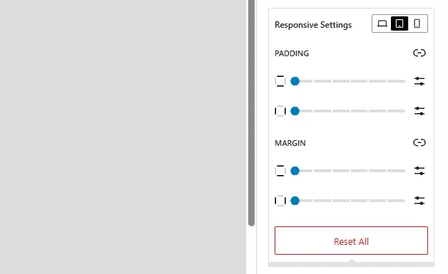
Desktop uses the default block controls as your base layout. Tablet and Mobile let you add responsive overrides on top of that base.
For visibility, the workflow is:
- Select a block.
- Open the block settings sidebar.
- Go to the Styles area.
- Open Responsive Visibility.
- Choose whether to hide the block on desktop, tablet, or mobile.
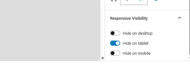
This is useful when a block works well on one device but should be hidden on another.
Preview Across Devices in the Editor
Strakture Responsive Controls are built to work with the WordPress editor’s device preview.
When you switch between Desktop, Tablet, and Mobile inside the responsive settings, Strakture follows the editor preview and helps you make changes in the right context.
This makes it easier to:
- check spacing at smaller screen sizes
- hide blocks only where needed
- confirm that layout adjustments still feel balanced across devices
Using device preview while making changes is the best way to avoid surprises on the frontend.
When to Use Responsive Controls
Responsive Controls are especially useful when:
- a section has too much spacing on mobile
- a block needs different margin or padding on tablet
- a decorative block should be hidden on smaller screens
- a layout feels balanced on desktop but crowded on mobile
They are meant for targeted per-block adjustments, not full layout redesigns.
Tips for Better Results
- Start with the default desktop layout first.
- Add tablet and mobile overrides only where needed.
- Use the editor’s device preview while adjusting spacing.
- Hide blocks sparingly so mobile layouts stay clear without losing important content.
- Check the final page on real devices when possible.