
A good Avenir font pairing takes one of the cleanest sans-serifs ever drawn and gives it a partner that adds warmth or contrast. Avenir looks sharp on its own. Pair it well and a whole page feels designed on purpose.
The tricky part is that Avenir is a paid font, not something you can drop into a website for free. So this guide does two things.
First, it shows eight pairings that make Avenir shine. Then it gives you free Google Font alternatives you can actually use on a WordPress site, with partners for each.
What Pairs Well With Avenir
Why do some fonts sit beside Avenir like they belong, while others fight it? Contrast. A strong Avenir font pairing sets the geometric, even strokes of Avenir against a serif with more personality.
Avenir is a geometric humanist sans-serif. Its letters are open and rounded, which reads as modern and friendly. Put a classic serif underneath it for body text and you get clarity up top with warmth below.
The other route is a single-family pairing. Use a heavy weight like Avenir Black for headings and Avenir Book for body copy. That keeps a design minimal while still creating clear hierarchy through weight alone.
Two quick checks keep any combination from looking off. Match the x-height so both fonts feel the same size at a glance. Then confirm the serif has enough stroke contrast to stand apart from the even lines of Avenir. When both hold, the pair reads as one intentional system rather than two fonts sharing a page.
8 Avenir Font Pairings That Work
You could test combinations for an hour and still second-guess yourself. Start from these instead. Each pairing below balances Avenir with a partner chosen for a specific mood and use.
| Pair Avenir with | Type | Mood | Best for |
|---|---|---|---|
| Playfair Display | Display serif | Elegant, high contrast | Fashion, beauty |
| Georgia | Web-safe serif | Readable, classic | Blogs, editorial |
| Merriweather | Serif | Warm, screen-friendly | Long-form articles |
| Minion Pro | Old-style serif | Refined, bookish | Portfolios, print |
| Roboto Slab | Slab serif | Modern, sturdy | Tech, product sites |
| Avenir Book + Black | Same family | Clean, minimal | Corporate, UI |
| Cormorant Garamond | Display serif | Delicate, luxe | Weddings, luxury |
| PT Serif | Transitional serif | Neutral, steady | Business, docs |
A few stand out. Avenir with Playfair Display is the fashion-editorial classic: the serif brings drama, Avenir keeps the body calm. For anything read at length, Merriweather was drawn for screens and holds up in small sizes better than most.
When you want restraint, the single-family option wins. Avenir Black headings over Avenir Book body text need no second typeface at all.
Avenir Next Font Pairing Options
Chances are you have seen Avenir Next without knowing it, since it ships on Apple devices. An Avenir Next font pairing follows the same logic as the original, with a bit more flexibility.
Avenir Next carries a wider range of weights, from thin to heavy. That makes single-family hierarchy even easier. For a two-font look, the same serifs apply: Georgia and Merriweather for readable body copy, Playfair Display or Cormorant Garamond when you want a luxury edge.
Free Web Alternatives to Avenir
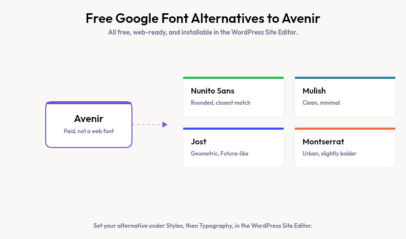
Here is the honest catch. Avenir is licensed, and loading it on a live site means paying for web font rights. Most WordPress users are better served by a free lookalike from Google Fonts, which loads fast and costs nothing.
| Free alternative | Character | Pair it with |
|---|---|---|
| Nunito Sans | Rounded, closest overall match | Lora or Merriweather |
| Mulish | Clean, minimal geometric | Source Serif 4 |
| Jost | Geometric, Futura-like | PT Serif |
| Montserrat | Urban, slightly bolder | Merriweather |
To use one in a block theme, open the Site Editor, go to Styles, then Typography, and set your heading and body fonts. Developers can register the same fonts in theme.json so every block inherits them automatically.
Once your fonts live in the theme, new sections should follow them. Strakture reads your active theme’s typography and generates block patterns that already use your chosen fonts, so a fresh hero or feature grid matches the type you picked without manual restyling.
Pick a Pairing, Then Build Around It
A strong Avenir font pairing comes down to contrast and restraint: one geometric sans, one serif with character, or a single family split by weight. If Avenir is out of budget, Nunito Sans or Mulish gets you close for free. Pair your type with a balanced website color scheme and the whole design clicks.
Once your fonts are set, Strakture keeps every new pattern on the same type system, so your site stays consistent as it grows. Your pairing does the work, and each section falls in line.
What font pairs best with Avenir?
A contrasting serif pairs best with Avenir. Playfair Display suits fashion and luxury, Merriweather works for long-form reading, and Georgia is a safe, readable classic. For a minimal look, pair Avenir Black headings with Avenir Book body text and skip a second typeface entirely.
Is there a free alternative to Avenir?
Yes. Nunito Sans is the closest free match on Google Fonts, with a similar rounded, geometric feel. Mulish, Jost, and Montserrat also work well. All four are free to use on any website, load quickly, and install directly through the WordPress Site Editor.
What kind of font is Avenir?
Avenir is a geometric humanist sans-serif designed by Adrian Frutiger in 1988. Its rounded, even letterforms read as clean and modern. The name means “future” in French, a nod to its geometric roots in earlier typefaces like Futura, softened for better readability.
Can I use Avenir on my WordPress site?
Only with a paid web font license, since Avenir is not free. Most site owners choose a free Google Font alternative like Nunito Sans instead. You add it in the Site Editor under Styles and Typography, then set it as your heading or body font sitewide.

Leave a Reply