
Good website color schemes do more than look nice. They guide the eye, signal your brand, and make a page feel finished before a visitor reads a word. Pick the wrong palette and even great content feels off.
Most designers start from a color they like and hope the rest falls into place. That guesswork is why so many sites end up with clashing buttons and muddy backgrounds.
This guide gives you eight ready-to-use palettes with hex codes, the rules behind why they work, and a fast way to apply one to a WordPress site.
What Makes Website Color Schemes Work
What separates a palette that sells from one that distracts? Structure. The best website color schemes follow the 60-30-10 rule: 60% dominant color, 30% secondary, 10% accent for buttons and links.
That ratio keeps a page calm while giving your call to action somewhere loud to live. Your dominant tone usually carries backgrounds and large areas. The accent earns attention precisely because it stays rare.
Contrast matters just as much as harmony. Text needs a contrast ratio of at least 4.5 to 1 against its background to pass WCAG accessibility standards. Run any pairing through the WebAIM contrast checker before you commit.
8 Website Color Schemes With Hex Codes
You’ve stared at a blank palette wondering where to begin. Start here instead. Each of these website color combinations is balanced for contrast and ready to drop into a real site.
| Scheme | Dominant | Secondary | Accent | Best for |
|---|---|---|---|---|
| Modern Slate | #1E293B | #94A3B8 | #3B82F6 | SaaS and tech |
| Fresh Mint | #064E3B | #6EE7B7 | #F59E0B | Health and eco |
| Warm Sand | #292524 | #D6D3D1 | #EA580C | Agencies, portfolios |
| Coastal Teal | #0F766E | #5EEAD4 | #F43F5E | Creative studios |
| Bold Contrast | #0A0A0A | #737373 | #DC2626 | Fashion, bold brands |
| Soft Blush | #831843 | #FBCFE8 | #6366F1 | Beauty, lifestyle |
| Deep Ocean | #0C4A6E | #7DD3FC | #0EA5E9 | Finance, corporate |
| Sunset Warmth | #1E3A8A | #FDBA74 | #F97316 | Startups, events |
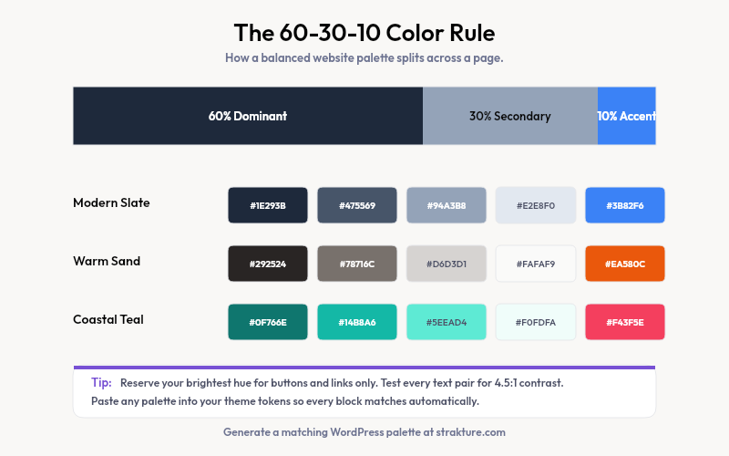
A few deserve extra notes. Modern Slate is the classic blue gray website color scheme that reads clean and trustworthy, which is why so many software brands lean on it. Warm Sand pairs neutral browns with a burnt-orange accent for a calm, editorial feel.
Bold Contrast keeps things near-monochrome, then lets one red accent do all the shouting. Sunset Warmth shows how a blue and orange pairing stays energetic without tipping into chaos.
How to Choose a Palette That Fits Your Brand
Only 8% of visitors will consciously notice your colors, yet all of them react to the mood those colors set. So pick for feeling first, then refine for accessibility.
Match the tone to your work. Cool blues and grays signal stability for finance and tech. Warm oranges and reds read as friendly and urgent, which suits food, events, and sales pages. Greens lean toward health, growth, and sustainability.
- Start with one brand color, then build the rest around it
- Keep backgrounds light or very dark, never a saturated mid-tone
- Reserve your brightest hue for buttons and links only
- Test every text-and-background pair for contrast before launch
A modern website color scheme rarely uses more than four or five colors total. When you feel tempted to add a sixth, adjust the shade of one you already have instead.
Plan for dark mode early if your audience expects it. Rather than inverting every value, define a second set of shades: deep backgrounds, softened text, and an accent bright enough to stay visible. A palette that ignores dark mode often breaks the moment a visitor switches their device theme.
Turning a Scheme Into a WordPress Palette
Here is where a great palette often falls apart. You pick the hex codes, then have to wire them into your theme by hand, one setting at a time. Block themes make this easier through theme.json and Global Styles.
Your theme stores its palette as named color tokens. Set them once and every block pulls from those values automatically. The trick is generating a full, balanced set of tokens rather than dropping in five random hex codes.
Our free WordPress color palette generator builds a complete, accessible palette you can paste straight into your theme. Once your colors live in Global Styles, Strakture can generate block patterns that already use them, so new sections match your site from the first insert.
Build a Cohesive Site, Faster
Strong website color schemes come down to a few rules: one dominant tone, a supporting shade, a single loud accent, and enough contrast to stay readable. Pick a palette above, test it, and lock it into your theme tokens.
If you would rather skip the manual setup, Strakture reads your theme and generates patterns that match your chosen colors automatically. Your palette does the design work, and every new section falls in line.
What is the best color scheme for a website?
There is no single best color scheme, only the best fit for your brand and audience. A blue gray palette suits tech and finance, warm neutrals suit portfolios, and green works for health brands. Whatever you pick, follow the 60-30-10 ratio and pass contrast checks for readability.
How many colors should a website use?
Most effective sites use three to five colors: one dominant, one or two secondary, and a single accent. Add neutral shades of black, white, or gray for text and backgrounds. More than five main colors usually looks busy and weakens your call to action.
How do I add a color palette to WordPress?
Open the Site Editor, go to Styles, then Colors, and edit your theme palette. Enter your hex codes as named colors so blocks reference them automatically. A palette generator speeds this up by producing a full, accessible set of tokens you can paste in at once.
What is the 60-30-10 rule in web design?
The 60-30-10 rule splits a design into three color proportions. Your dominant color covers about 60% of the page, a secondary color fills 30%, and an accent takes the final 10% for buttons and highlights. It keeps layouts balanced and guides attention where you want it.

Leave a Reply