Your WordPress color palette shapes how visitors feel about your site before they read a single word. Pick the wrong colors, and even polished content looks amateurish. Pick the right ones, and every page feels intentional.
The challenge is bridging the gap between color theory and actual WordPress implementation. Most advice stops at “choose colors that match your brand.” That is not helpful when you are staring at a theme.json file or trying to figure out which hex codes belong in your Global Styles panel.
This guide covers both sides. You will learn how to select colors that work together, then how to implement them in WordPress so every block, pattern, and template inherits your palette automatically.
Why Your WordPress Color Palette Matters
Color is the fastest signal your site sends. Research from the Missouri University of Science and Technology found that users form visual opinions about a website within 50 milliseconds, and color is the dominant factor in that snap judgment. Before anyone processes your headline or navigation, they have already decided whether your site looks trustworthy.
Three measurable reasons your color palette deserves deliberate attention:
First impressions drive bounce rate. A 2019 study published in the journal Behaviour & Information Technology found that 94% of first impressions about websites are design-related, with color and layout accounting for the majority of those judgments. Visitors who feel visually uncomfortable leave. A cohesive palette keeps them scrolling.
Color drives brand recognition. According to research published by the University of Winnipeg in the journal Management Decision, people make subconscious judgments about products within 90 seconds, and between 62% and 90% of that assessment is based on color alone. Consistent color use across your site reinforces your identity every time someone visits.
Contrast affects conversions. A Shopify analysis of over 2.3 million storefronts in 2026 found that product pages with intentionally curated color palettes converted at a rate 31% higher than those without a defined color strategy. Color is not decoration. It is a conversion lever.
Color Theory Basics for Web Design
You do not need an art degree. You need to understand three roles and five harmony modes.
The Three Color Roles
Primary color: Your brand’s main color. It dominates headers, buttons, and links. Most visitors will associate this color with your brand.
Secondary color: Supports the primary. Used for backgrounds, section dividers, hover states, and secondary buttons. It should complement the primary without competing for attention.
Accent color: The high-contrast spark used sparingly for calls to action, notifications, badges, and highlights. An effective accent color stands out from both the primary and secondary.
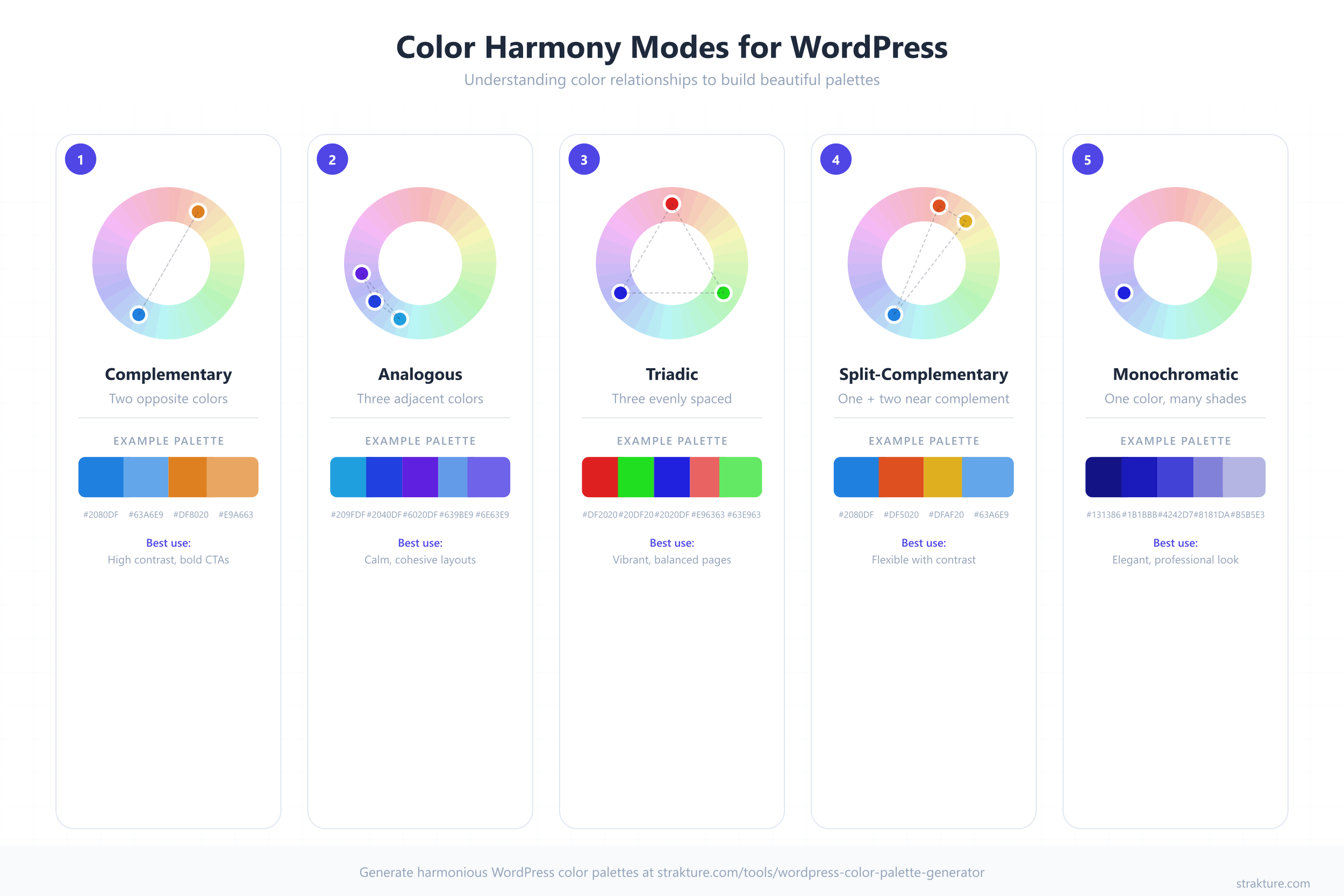
Five Harmony Modes
Harmony modes are systematic methods for choosing colors that naturally work together. Instead of guessing, you pick a starting color and let the color wheel do the math.
| Mode | Description | Best For | Example |
|---|---|---|---|
| Complementary | Two colors directly opposite on the color wheel | Bold contrast, CTAs that pop | Blue (#2563EB) + Orange (#EA580C) |
| Analogous | Three colors adjacent on the wheel | Calm, harmonious layouts | Teal (#0D9488) + Blue (#0284C7) + Indigo (#4F46E5) |
| Triadic | Three colors equally spaced (120 degrees apart) | Vibrant, balanced designs | Red (#DC2626) + Blue (#2563EB) + Yellow (#CA8A04) |
| Split-Complementary | One base color plus two colors adjacent to its complement | Contrast with less tension | Blue (#2563EB) + Orange-Red (#EA580C) + Yellow-Orange (#D97706) |
| Monochromatic | One hue at different shades, tints, and tones | Elegant, focused brands | Navy (#1E3A5F) + Blue (#3B82F6) + Light Blue (#93C5FD) |
Complementary palettes deliver the strongest contrast. Analogous palettes feel the most cohesive. Monochromatic palettes are the safest choice when you are unsure. Each approach is valid depending on your goals.
How to Choose Your WordPress Color Palette (Step by Step)
Step 1: Start with Your Brand’s Primary Color
If you already have a brand, your primary color is decided. Use it as your starting point. If you are building from scratch, choose one color that reflects the feeling you want visitors to experience.
- Blue communicates trust and reliability (used by banks, SaaS, healthcare)
- Green signals growth and health (used by wellness brands, finance, eco-products)
- Red creates urgency and energy (used by food, entertainment, sales-driven sites)
- Purple suggests creativity and premium quality (used by beauty, education, luxury)
- Orange evokes warmth and enthusiasm (used by construction, food, creative agencies)
Pick one. Commit. You will build everything else around it.
Step 2: Choose a Harmony Mode
Take your primary color and apply one of the five harmony modes from the table above. For most WordPress sites, analogous or split-complementary produces the most usable results. They give you enough variety for buttons, backgrounds, and accents without creating visual chaos.
If your site is content-heavy (blog, documentation, news), lean toward monochromatic or analogous. If it is conversion-focused (landing pages, SaaS, ecommerce), complementary or split-complementary gives your CTAs more punch.
Step 3: Select Accent and Neutral Colors
Your harmony mode gives you chromatic colors. Now you need neutrals. Every WordPress color palette needs:
- Background: Typically white (#FFFFFF) or a very light tint of your primary
- Text: Dark gray (#1F2937) rather than pure black. Pure black on white creates harsh contrast that strains eyes over long reading sessions
- Muted/secondary background: A light gray (#F3F4F6) or tinted neutral for alternating sections
- Border/divider: A medium gray (#D1D5DB) for subtle separation
Most effective WordPress palettes use 5 to 8 total colors: 2 to 3 chromatic colors plus 3 to 5 neutrals. Anything beyond 8 becomes difficult to use consistently.
Step 4: Test for Accessibility
Color accessibility is not optional. The Web Content Accessibility Guidelines (WCAG) require a minimum contrast ratio of 4.5:1 for normal text and 3:1 for large text. Low-contrast color is the most common accessibility violation on the web, affecting 83.6% of all websites according to WebAIM’s 2025 analysis of the top one million sites.
Check every text-and-background combination in your palette:
- Body text on your background color: must hit 4.5:1
- Button text on your button background: must hit 4.5:1
- Link text on surrounding backgrounds: must hit 4.5:1
- Large headings (18px+ bold or 24px+ regular): must hit 3:1
Use the free WebAIM Contrast Checker to verify ratios before finalizing your palette. Failing this step means some visitors literally cannot read your site.
Step 5: Use a Generator Tool
Building a palette manually means toggling between color pickers, contrast checkers, and hex code spreadsheets. A generator tool compresses this into one step.
The Strakture Color Palette Generator is built specifically for WordPress. Enter your primary color, choose a harmony mode, and it generates a complete palette with the correct number of swatches for WordPress block themes. It also exports directly to theme.json format, so you can copy the output into your theme without manually writing JSON.
Other general-purpose tools like Coolors and Adobe Color work for initial exploration, but they do not output WordPress-ready code. You will need to manually translate their palettes into theme.json syntax.
Implementing Your Color Palette in WordPress
Choosing colors is only half the work. WordPress needs to know about your palette so the block editor, Global Styles, and every pattern on your site can reference it. Here are three methods, from simplest to most powerful.
Method 1: Global Styles in the Site Editor
This is the no-code approach. It works with any block theme.
- Go to Appearance > Editor in your WordPress dashboard
- Click the Styles icon (the half-filled circle in the top right)
- Select Colors
- Click the Palette section, then Custom
- Add each color from your palette with a descriptive name
WordPress saves these as user-level overrides. They take priority over your theme’s defaults and appear in every color picker across the editor. The limitation: if you switch themes, these custom colors stay but may not map to the new theme’s token slugs.
Method 2: Editing theme.json Directly
For full control, define your palette in your theme’s theme.json file. This is the approach theme developers use, and it gives you permanent, version-controlled color definitions.
Add your palette under settings.color.palette:
{
  "version": 3,
  "settings": {
    "color": {
      "palette": [
        {
          "slug": "primary",
          "color": "#2563EB",
          "name": "Primary"
        },
        {
          "slug": "secondary",
          "color": "#1E3A5F",
          "name": "Secondary"
        },
        {
          "slug": "accent",
          "color": "#EA580C",
          "name": "Accent"
        },
        {
          "slug": "base",
          "color": "#FFFFFF",
          "name": "Base"
        },
        {
          "slug": "contrast",
          "color": "#1F2937",
          "name": "Contrast"
        },
        {
          "slug": "muted",
          "color": "#F3F4F6",
          "name": "Muted"
        }
      ]
    }
  }
}
WordPress automatically generates CSS custom properties from each entry. The slug “primary” becomes --wp--preset--color--primary. Every block in the editor can reference these colors by name, and changing the hex value in theme.json updates every block that uses that color. (For a deeper dive, see our guide to WordPress design tokens.)
If you are using a child theme, place this in the child theme’s theme.json. It will override the parent theme’s palette while inheriting everything else.
Method 3: Using a Color Palette Generator with theme.json Export
Writing JSON by hand is tedious and error-prone. Miss a comma or misspell a slug, and the entire palette breaks silently.
The Strakture Color Palette Generator eliminates this step. Build your palette visually, preview how the colors look together, then export the complete settings.color.palette JSON block ready to paste into your theme.json. No syntax errors. No guessing at slug conventions.
This approach is especially useful if you are building a WordPress design system from scratch. Your color tokens become the foundation that typography, spacing, and block patterns build on.
Color Palette Examples for Different Industries
Theory is easier to apply when you can see it in practice. Here are five palettes tailored to common WordPress site types, with hex codes you can use directly.
| Industry | Primary | Secondary | Accent | Background | Text | Harmony Mode |
|---|---|---|---|---|---|---|
| SaaS / Tech | #2563EB (Blue) | #1E40AF (Dark Blue) | #10B981 (Emerald) | #F8FAFC (Slate 50) | #0F172A (Slate 900) | Split-Complementary |
| Restaurant / Food | #DC2626 (Red) | #991B1B (Dark Red) | #F59E0B (Amber) | #FFFBEB (Warm White) | #1C1917 (Stone 900) | Analogous |
| Portfolio / Creative | #0F172A (Near Black) | #334155 (Slate 700) | #F97316 (Orange) | #FFFFFF (White) | #1E293B (Slate 800) | Monochromatic + Accent |
| Ecommerce / Fashion | #7C3AED (Violet) | #4C1D95 (Deep Violet) | #EC4899 (Pink) | #FAF5FF (Violet 50) | #1E1B4B (Indigo 950) | Analogous |
| Health / Wellness | #059669 (Emerald) | #065F46 (Dark Emerald) | #0EA5E9 (Sky Blue) | #F0FDF4 (Green 50) | #14532D (Green 900) | Analogous |
Each palette follows the same structure: a strong primary, a deeper secondary for depth, a contrasting accent for CTAs, a near-white background tinted toward the primary hue, and a dark text color that hits WCAG contrast ratios against the background.
You can plug any of these into the theme.json snippet above by replacing the hex values. Or enter the primary color into a color palette generator and let it build the supporting colors for you.
Common Color Palette Mistakes to Avoid
Using Too Many Colors
More than 8 colors in your palette creates inconsistency. Contributors start choosing different shades for the same purpose. Buttons end up in three different blues. Section backgrounds alternate between four grays that look nearly identical on some monitors. Limit your chromatic colors to 3 and your neutrals to 4 or 5.
Ignoring Contrast Ratios
Light gray text on a white background might look minimal and modern on your high-resolution display. On a budget laptop in a sunny room, it becomes unreadable. Always verify your palette against WCAG 4.5:1 contrast ratios for body text. Accessibility is not a bonus feature. With the European Accessibility Act in effect since June 2025 and over 4,600 ADA lawsuits filed in 2024, it is also a legal requirement for many sites.
Hardcoding Colors Instead of Using Tokens
If you set a heading to #2563EB directly instead of selecting “Primary” from the color picker, you break the token chain. That heading will not update when you change your primary color in theme.json. Multiply this across hundreds of blocks, and you have a maintenance nightmare. Always use named palette colors in the editor, never raw hex values.
Choosing Colors in Isolation
A color that looks perfect on its own can fail next to your other colors. Always evaluate your palette as a complete set. Preview it on a realistic page layout with text, buttons, images, and white space. Redesigning your WordPress site later because the palette clashes is far more expensive than testing upfront.
Forgetting Dark Backgrounds
Many WordPress sites use dark sections for testimonials, footers, or feature highlights. Your palette needs to work on dark backgrounds too. Make sure your light text color hits contrast ratios against your dark section background, not just your primary background.
Start Building Your Palette
A deliberate WordPress color palette improves every metric that matters: first impressions, brand recognition, readability, and conversions. The process is straightforward once you follow it step by step.
- Pick your primary color
- Choose a harmony mode
- Add neutrals
- Verify accessibility
- Implement in theme.json
If you want to skip the manual work, the Strakture Color Palette Generator handles steps 2 through 5 in one tool. Build your palette, export the theme.json code, and paste it into your theme. And when you are ready to build pages that actually match your new palette, Strakture generates AI-powered block patterns that read your theme’s color tokens and produce designs that look native to your site from the first insert.
Start with one color. Build out from there.
How many colors should a WordPress color palette have?
Most effective WordPress palettes use 5 to 8 total colors: 2 to 3 chromatic colors (primary, secondary, accent) plus 3 to 5 neutrals (background, text, muted, border). WordPress theme.json supports as many colors as you define, but keeping the count under 8 ensures consistent usage across your site.
Can I change my WordPress color palette without breaking my site?
Yes, if your blocks reference named palette colors (tokens) instead of hardcoded hex values. When you change a color in theme.json or Global Styles, every block using that token updates automatically. Blocks with hardcoded colors will not change and will need manual editing.
What is the best color palette format for WordPress block themes?
The standard format is the settings.color.palette array in theme.json. Each color needs three properties: a slug (used for the CSS variable), a hex color value, and a human-readable name. WordPress converts these into CSS custom properties like --wp--preset--color--primary that every block can reference.
What contrast ratio do I need for accessible colors?
WCAG 2.1 Level AA requires a minimum contrast ratio of 4.5:1 for normal body text and 3:1 for large text (18px bold or 24px regular). Level AAA requires 7:1 for normal text. Use a contrast checker tool to verify every text-and-background combination in your palette before implementing it.
Do I need a different color palette for each WordPress theme?
Your brand colors stay the same regardless of theme. What changes is how you register them. Each block theme uses its own slug conventions in theme.json. When switching themes, you may need to re-map your colors to the new theme’s slug structure so that blocks reference the correct tokens.
Leave a Reply