Every block theme starts with one file. A WordPress theme.json example that actually works can save you hours of guessing which property goes where, what slug format to use, and why your color palette refuses to show up in the editor. This post gives you copy-paste snippets for every major settings category, organized so you can grab exactly what you need.
WordPress.org documentation covers the schema. Kinsta and WPEngine tutorials walk through concepts. But when you just need working JSON you can drop into your theme, those resources force you to piece fragments together. The snippets below are tested against version 3 of theme.json and WordPress 6.6 or later.
If you want the conceptual background on how theme.json fits into WordPress design systems, read WordPress Design Tokens: What They Are and Why They Matter first. This post is the practical companion to that theory.
Quick-Reference Table for WordPress Theme JSON Settings
Before jumping into snippets, here is a map of every settings category covered in this guide. Bookmark this table and use it as a cheat sheet when building your next block theme.
| Setting Category | Key Property | Example Value |
|---|---|---|
| Colors | settings.color.palette | #0066cc |
| Gradients | settings.color.gradients | linear-gradient(135deg, ...) |
| Duotone | settings.color.duotone | ["#000", "#0066cc"] |
| Font Families | settings.typography.fontFamilies | "Inter", sans-serif |
| Font Sizes | settings.typography.fontSizes | clamp(1rem, 2vw, 1.5rem) |
| Spacing | settings.spacing.spacingSizes | 1.5rem |
| Layout | settings.layout.contentSize | 840px |
| Shadows | settings.shadow.presets | 0 4px 12px rgba(0,0,0,0.1) |
| Borders | settings.border.radius | true |
| Block Overrides | settings.blocks.core/button | Per-block settings object |
| Style Variations | /styles/dark.json | Alternate theme preset file |
The Minimal WordPress Theme JSON Example
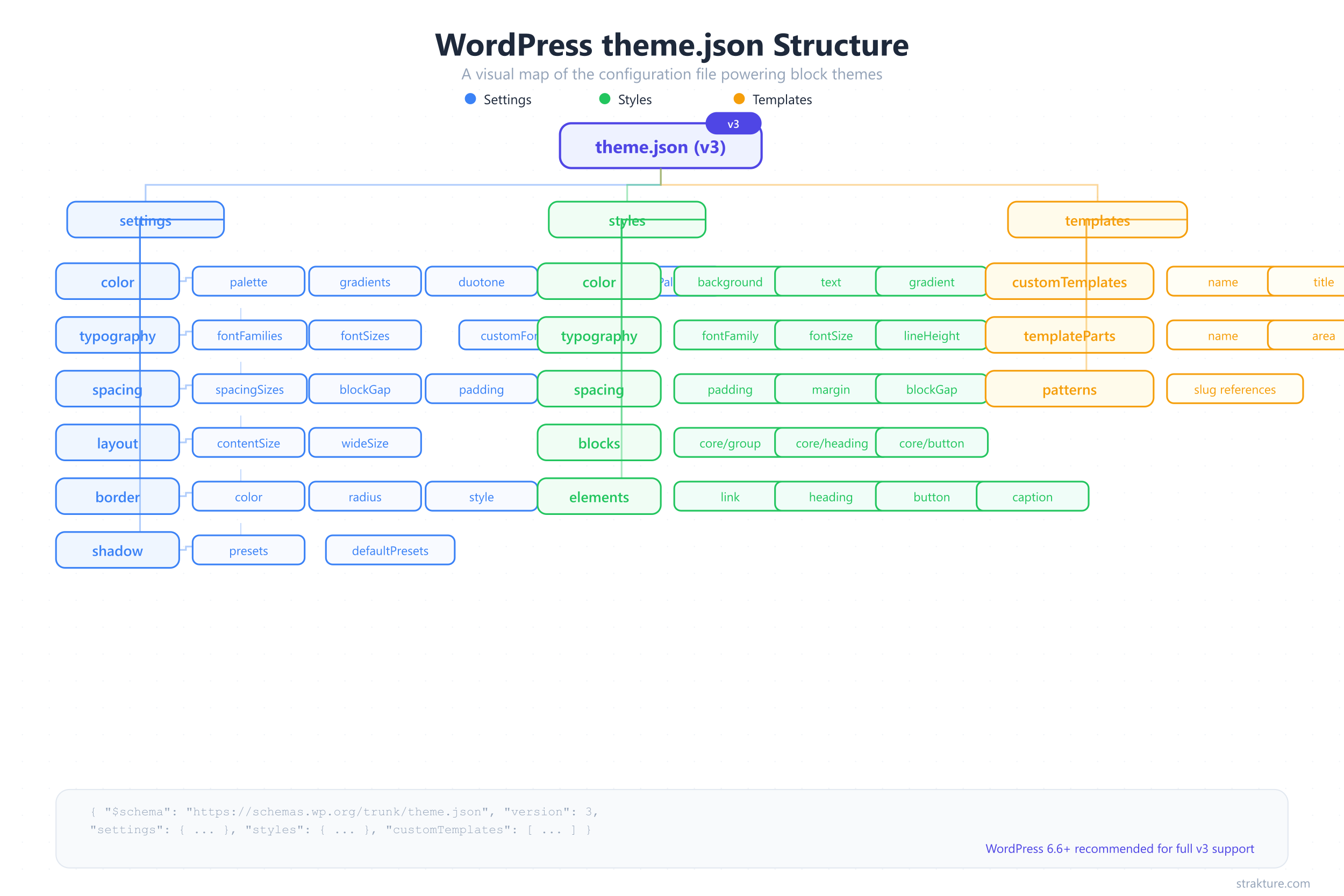
Every theme.json file needs two properties to work: a version number and at least one settings or styles object. Strip away everything else and you get this skeleton.
{
  "$schema": "https://schemas.wp.org/trunk/theme.json",
  "version": 3,
  "settings": {},
  "styles": {}
}
The $schema line is optional but valuable. It gives your code editor autocomplete and validation against the official WordPress schema. Point it at https://schemas.wp.org/trunk/theme.json for the latest spec, or pin it to a specific WordPress release like https://schemas.wp.org/wp/6.7/theme.json.
Gotcha: Version 3 requires WordPress 6.6 or later. If your theme targets older installs, stick with version 2. WordPress will auto-migrate version 2 files internally, but version 3 unlocks new defaults controls covered later in this guide.
Colors: Custom Palette, Gradients, and Duotone
Color settings are where most theme developers start. A well-defined palette prevents users from picking random hex values that break your design. It also generates CSS custom properties that every block can reference.
Custom Color Palette
{
  "version": 3,
  "settings": {
    "color": {
      "defaultPalette": false,
      "palette": [
        { "slug": "base", "color": "#ffffff", "name": "Base" },
        { "slug": "contrast", "color": "#1a1a2e", "name": "Contrast" },
        { "slug": "primary", "color": "#0066cc", "name": "Primary" },
        { "slug": "secondary", "color": "#e94560", "name": "Secondary" },
        { "slug": "tertiary", "color": "#f5f5f5", "name": "Tertiary" }
      ]
    }
  }
}
Each palette entry produces a CSS custom property: --wp--preset--color--primary resolves to #0066cc. WordPress also creates utility classes like .has-primary-color and .has-primary-background-color.
Gotcha: Setting "defaultPalette": false hides the built-in WordPress colors. Without it, users see both your palette and the default colors, which leads to off-brand choices. According to the WordPress Theme Handbook, the default palette includes Black, Cyan Bluish Gray, White, and Pale Pink among others.
Gradient Presets
"gradients": [
  {
    "slug": "primary-to-secondary",
    "gradient": "linear-gradient(135deg, var(--wp--preset--color--primary) 0%, var(--wp--preset--color--secondary) 100%)",
    "name": "Primary to Secondary"
  },
  {
    "slug": "light-fade",
    "gradient": "linear-gradient(180deg, var(--wp--preset--color--tertiary) 0%, var(--wp--preset--color--base) 100%)",
    "name": "Light Fade"
  }
]
Gradients live inside settings.color.gradients. Reference your palette colors with var() so gradient presets update automatically when palette values change. The generated property follows the pattern --wp--preset--gradient--primary-to-secondary.
Gotcha: If you also want to disable the default WordPress gradient presets, add "defaultGradients": false inside the color object. Otherwise users get both sets.
Duotone Filters
"duotone": [
  {
    "slug": "brand-duotone",
    "colors": ["#1a1a2e", "#0066cc"],
    "name": "Brand Duotone"
  },
  {
    "slug": "warm-duotone",
    "colors": ["#1a1a2e", "#e94560"],
    "name": "Warm Duotone"
  }
]
Duotone filters apply to images and cover blocks. The colors array takes exactly two values: the shadow color (darks) and the highlight color (lights). WordPress renders them as SVG filters, not CSS.
Gotcha: Duotone does not generate CSS custom properties like palette or gradient presets do. You cannot reference a duotone preset with var() in your stylesheets.
Typography: Fonts, Sizes, and Fluid Scaling
Typography settings control which fonts appear in the editor, how large text options scale, and whether sizes respond fluidly to viewport width. Getting this right means users pick from your intended type scale instead of typing arbitrary pixel values.
Registering Font Families with fontFace
The recommended approach in theme.json is to bundle font files locally and declare them with fontFace. This avoids external requests to Google Fonts and improves page speed. Download your .woff2 files into an assets/fonts/ directory, then register them.
{
  "version": 3,
  "settings": {
    "typography": {
      "fontFamilies": [
        {
          "name": "Inter",
          "slug": "inter",
          "fontFamily": "'Inter', sans-serif",
          "fontFace": [
            {
              "fontFamily": "Inter",
              "fontWeight": "400",
              "fontStyle": "normal",
              "src": ["file:./assets/fonts/inter-regular.woff2"]
            },
            {
              "fontFamily": "Inter",
              "fontWeight": "700",
              "fontStyle": "normal",
              "src": ["file:./assets/fonts/inter-bold.woff2"]
            }
          ]
        },
        {
          "name": "System Sans",
          "slug": "system-sans",
          "fontFamily": "-apple-system, BlinkMacSystemFont, 'Segoe UI', Roboto, Oxygen, Ubuntu, sans-serif"
        }
      ]
    }
  }
}
The src path uses the file:./ prefix, which resolves relative to your theme root. WordPress enqueues these fonts in both the editor and the front end automatically. The generated property is --wp--preset--font-family--inter.
Gotcha: Variable fonts that cover a weight range use "fontWeight": "100 900" as a string with a space, not a number. If you register a variable font file but set fontWeight to "400", you lose access to bold and light weights.
Fluid Font Sizes
Fluid typography lets text scale smoothly between a minimum and maximum size based on viewport width. WordPress generates clamp() values behind the scenes when you enable it.
{
  "version": 3,
  "settings": {
    "typography": {
      "defaultFontSizes": false,
      "fluid": true,
      "fontSizes": [
        {
          "slug": "small",
          "size": "0.875rem",
          "name": "Small",
          "fluid": { "min": "0.8rem", "max": "0.875rem" }
        },
        {
          "slug": "medium",
          "size": "1rem",
          "name": "Medium",
          "fluid": { "min": "0.9rem", "max": "1.125rem" }
        },
        {
          "slug": "large",
          "size": "1.75rem",
          "name": "Large",
          "fluid": { "min": "1.25rem", "max": "1.75rem" }
        },
        {
          "slug": "x-large",
          "size": "2.5rem",
          "name": "Extra Large",
          "fluid": { "min": "1.75rem", "max": "2.5rem" }
        }
      ]
    }
  }
}
With fluid enabled globally and per-size min/max values, WordPress outputs something like --wp--preset--font-size--large: clamp(1.25rem, 1.25rem + ((1vw - 0.2rem) * 0.625), 1.75rem). Text grows proportionally without jarring breakpoints.
Gotcha: If you set "fluid": true globally but omit min/max on a specific size, WordPress calculates defaults automatically. Those defaults might not match your type scale. Always specify min and max explicitly for precise control.
Spacing: Scale, Padding, and Block Gap
Consistent spacing separates polished themes from amateur ones. WordPress theme.json spacing lets you define a fixed set of spacing tokens that appear in the editor’s spacing controls, preventing arbitrary values.
Custom Spacing Sizes
{
  "version": 3,
  "settings": {
    "spacing": {
      "defaultSpacingSizes": false,
      "spacingSizes": [
        { "slug": "10", "size": "0.25rem", "name": "2XS" },
        { "slug": "20", "size": "0.5rem", "name": "XS" },
        { "slug": "30", "size": "1rem", "name": "S" },
        { "slug": "40", "size": "1.5rem", "name": "M" },
        { "slug": "50", "size": "2rem", "name": "L" },
        { "slug": "60", "size": "3rem", "name": "XL" },
        { "slug": "70", "size": "4.5rem", "name": "2XL" }
      ],
      "padding": true,
      "margin": true,
      "blockGap": true
    }
  }
}
Each entry generates --wp--preset--spacing--40 for the slug “40”, resolving to 1.5rem. The editor shows a slider with these named stops instead of a free-form pixel input. Setting blockGap to true enables the Block Spacing control for groups, columns, and gallery blocks.
Gotcha: Numeric slugs must be strings ("40" not 40). In theme.json version 3, if you define custom spacingSizes but forget to set "defaultSpacingSizes": false, your custom sizes show alongside the WordPress defaults, creating duplicate entries.
Using Spacing Scale Instead
If you prefer a generated scale over manual sizes, use spacingScale to auto-create steps.
"spacingScale": {
  "operator": "*",
  "increment": 1.5,
  "steps": 7,
  "mediumStep": 1.5,
  "unit": "rem"
}
This multiplies each step by 1.5, starting from the medium value, producing a geometric progression. Choose "+" for linear spacing or "*" for exponential. The generated custom properties follow the same --wp--preset--spacing--{slug} pattern.
Layout: Content Width and Wide Width
Two properties control the horizontal rhythm of every page in your theme. Without them, blocks stretch to the full viewport width with no structure.
{
  "version": 3,
  "settings": {
    "layout": {
      "contentSize": "840px",
      "wideSize": "1200px"
    },
    "useRootPaddingAwareAlignments": true
  }
}
contentSize sets the default max-width for all blocks. wideSize defines the maximum width for blocks using the “Wide width” alignment. Together they create a readable content column with room for wider elements like images and tables.
Gotcha: Without "useRootPaddingAwareAlignments": true, full-width blocks ignore root-level padding. This setting was introduced in WordPress 6.1 and is required for full-width backgrounds that still respect horizontal padding. The Layout settings documentation has the full explanation.
Borders and Custom Shadow Presets
Border and shadow controls give users design flexibility without writing CSS. You decide which properties are available and define reusable shadow presets that match your theme’s visual style.
Enabling Border Controls
{
  "version": 3,
  "settings": {
    "border": {
      "color": true,
      "radius": true,
      "style": true,
      "width": true
    }
  }
}
Each boolean enables that specific border control in the editor. Set any to false to hide it. If you want buttons to always have rounded corners, combine this with block-level style overrides covered in the next section.
Custom Shadow Presets
{
  "version": 3,
  "settings": {
    "shadow": {
      "defaultPresets": false,
      "presets": [
        {
          "slug": "soft",
          "shadow": "0 2px 8px rgba(0, 0, 0, 0.08)",
          "name": "Soft"
        },
        {
          "slug": "medium",
          "shadow": "0 4px 16px rgba(0, 0, 0, 0.12)",
          "name": "Medium"
        },
        {
          "slug": "hard",
          "shadow": "4px 4px 0 rgba(0, 0, 0, 1)",
          "name": "Hard"
        }
      ]
    }
  }
}
Shadow presets appear in the editor dropdown for any block that supports box-shadow. The generated custom property is --wp--preset--shadow--soft. WordPress ships five default presets (Natural, Deep, Sharp, Outlined, Crisp). Set "defaultPresets": false to replace them with your own.
Gotcha: Shadow presets use settings.shadow.presets, not settings.shadow.palette. The naming differs from colors, which trips up developers who expect a consistent pattern.
Block-Level Overrides in Theme JSON
Global settings apply everywhere. But sometimes you need a specific block to behave differently. The settings.blocks object lets you override any global setting for individual block types.
{
  "version": 3,
  "settings": {
    "color": {
      "palette": [
        { "slug": "primary", "color": "#0066cc", "name": "Primary" },
        { "slug": "white", "color": "#ffffff", "name": "White" }
      ]
    },
    "blocks": {
      "core/button": {
        "border": {
          "radius": true
        },
        "color": {
          "palette": [
            { "slug": "primary", "color": "#0066cc", "name": "Primary" },
            { "slug": "secondary", "color": "#e94560", "name": "Secondary" },
            { "slug": "white", "color": "#ffffff", "name": "White" }
          ]
        }
      },
      "core/heading": {
        "typography": {
          "fontSizes": [
            { "slug": "medium", "size": "1.5rem", "name": "Medium" },
            { "slug": "large", "size": "2.25rem", "name": "Large" },
            { "slug": "x-large", "size": "3rem", "name": "Extra Large" }
          ]
        }
      }
    }
  }
}
In this snippet, buttons get an extra “Secondary” color option not available globally. Heading blocks get their own font-size scale separate from body text. The block-level palette completely replaces the global one for that block type.
Gotcha: Block-level settings do not merge with global settings. If you define a color palette for core/button, that block only sees the block-level palette. Repeat any global colors you still want available in that block’s picker.
You can also apply block-level styles, not just settings. Target a block under styles.blocks to set default colors, typography, or spacing for every instance.
{
  "version": 3,
  "styles": {
    "blocks": {
      "core/button": {
        "border": {
          "radius": "6px"
        },
        "shadow": "var(--wp--preset--shadow--soft)",
        "typography": {
          "fontWeight": "600"
        }
      }
    }
  }
}
Every button inherits a 6px border radius, the “Soft” shadow preset, and semi-bold font weight. Users can still override these per-block in the editor. This is how tools like Strakture read your theme’s design system. When your buttons, headings, and spacing are defined in theme.json, pattern generators can match them precisely. That is the difference between a pattern that looks native and one that clashes with your site.
Style Variations: Multiple Theme Presets
A single theme can ship multiple visual presets. Users pick between them in the Site Editor’s Styles panel. Each variation is a JSON file in your theme’s /styles directory.
{
  "version": 3,
  "title": "Dark Mode",
  "settings": {
    "color": {
      "palette": [
        { "slug": "base", "color": "#0f0f1a", "name": "Base" },
        { "slug": "contrast", "color": "#f0f0f0", "name": "Contrast" },
        { "slug": "primary", "color": "#6c9bff", "name": "Primary" },
        { "slug": "secondary", "color": "#ff6b8a", "name": "Secondary" }
      ]
    }
  },
  "styles": {
    "color": {
      "background": "var(--wp--preset--color--base)",
      "text": "var(--wp--preset--color--contrast)"
    }
  }
}
Save this as /styles/dark.json in your theme folder. WordPress reads the title property and displays “Dark Mode” in the style switcher. The variation can override settings, styles, or both.
Here is the expected folder structure:
your-theme/
  theme.json          (default variation)
  /styles/
    dark.json         (dark mode variation)
    warm.json         (warm color variation)
    minimal.json      (stripped-down variation)
Gotcha: Style variations only override settings and styles. They cannot add new templates or template parts. Also, the title property is required for the variation to appear in the Site Editor. Skip it and the file gets silently ignored.
Block themes with well-structured style variations give users real design flexibility while keeping everything within your intended system. The Twenty Twenty-Four default theme ships with several style variations you can study as reference.
Version 3 Changes: What Moved from V2
WordPress 6.6 introduced theme.json version 3 with two breaking changes. If you are migrating from version 2, these are the only differences that matter.
New: defaultFontSizes Control
In version 2, defining custom fontSizes with slugs like “small” or “large” automatically replaced the WordPress defaults. Version 3 changed that behavior. Now, custom sizes with default slugs show alongside the core presets unless you explicitly opt out.
{
  "version": 3,
  "settings": {
    "typography": {
      "defaultFontSizes": false,
      "fontSizes": [
        { "slug": "small", "size": "0.875rem", "name": "Small" },
        { "slug": "medium", "size": "1rem", "name": "Medium" },
        { "slug": "large", "size": "1.75rem", "name": "Large" }
      ]
    }
  }
}
Set "defaultFontSizes": false to get the v2 behavior back. The default slugs in version 3 are: small, medium, large, and x-large. Notice that normal and huge from v2 were removed.
New: defaultSpacingSizes Control
The same logic applies to spacing. Version 2 let you replace default spacing slugs silently. Version 3 requires explicit opt-out.
{
  "version": 3,
  "settings": {
    "spacing": {
      "defaultSpacingSizes": false,
      "spacingSizes": [
        { "slug": "20", "size": "0.5rem", "name": "XS" },
        { "slug": "40", "size": "1.5rem", "name": "M" },
        { "slug": "60", "size": "3rem", "name": "XL" }
      ]
    }
  }
}
If you previously disabled defaults with "spacingScale": { "steps": 0 }, remove that and use "defaultSpacingSizes": false instead. The version 3 announcement on Make WordPress Core covers the full migration path.
Quick Migration Checklist
- Change
"version": 2to"version": 3 - If you define custom fontSizes, add
"defaultFontSizes": false - If you define custom spacingSizes or spacingScale, add
"defaultSpacingSizes": false - Remove any
"spacingScale": { "steps": 0 }hack for hiding defaults - Test in WordPress 6.6+ before shipping
Putting the Full File Together
Over 75% of new WordPress themes submitted to the theme directory in 2025 use Full Site Editing, and every one includes a theme.json file. Block themes with a properly configured theme.json had 1,180 active listings and over 2.7 million combined installs as of early 2025. The file is no longer optional for modern WordPress development.
Here is a production-ready theme.json that combines the snippets above into one cohesive file. Copy it, adjust the values to match your brand, and you have a working design system.
{
  "$schema": "https://schemas.wp.org/trunk/theme.json",
  "version": 3,
  "settings": {
    "color": {
      "defaultPalette": false,
      "defaultGradients": false,
      "palette": [
        { "slug": "base", "color": "#ffffff", "name": "Base" },
        { "slug": "contrast", "color": "#1a1a2e", "name": "Contrast" },
        { "slug": "primary", "color": "#0066cc", "name": "Primary" },
        { "slug": "secondary", "color": "#e94560", "name": "Secondary" },
        { "slug": "tertiary", "color": "#f5f5f5", "name": "Tertiary" }
      ],
      "gradients": [
        {
          "slug": "primary-to-secondary",
          "gradient": "linear-gradient(135deg, var(--wp--preset--color--primary) 0%, var(--wp--preset--color--secondary) 100%)",
          "name": "Primary to Secondary"
        }
      ],
      "duotone": [
        {
          "slug": "brand-duotone",
          "colors": ["#1a1a2e", "#0066cc"],
          "name": "Brand Duotone"
        }
      ]
    },
    "typography": {
      "defaultFontSizes": false,
      "fluid": true,
      "fontFamilies": [
        {
          "name": "Inter",
          "slug": "inter",
          "fontFamily": "'Inter', sans-serif",
          "fontFace": [
            {
              "fontFamily": "Inter",
              "fontWeight": "100 900",
              "fontStyle": "normal",
              "src": ["file:./assets/fonts/inter-variable.woff2"]
            }
          ]
        },
        {
          "name": "System Sans",
          "slug": "system-sans",
          "fontFamily": "-apple-system, BlinkMacSystemFont, 'Segoe UI', Roboto, sans-serif"
        }
      ],
      "fontSizes": [
        { "slug": "small", "size": "0.875rem", "name": "Small", "fluid": { "min": "0.8rem", "max": "0.875rem" } },
        { "slug": "medium", "size": "1rem", "name": "Medium", "fluid": { "min": "0.9rem", "max": "1.125rem" } },
        { "slug": "large", "size": "1.75rem", "name": "Large", "fluid": { "min": "1.25rem", "max": "1.75rem" } },
        { "slug": "x-large", "size": "2.5rem", "name": "X-Large", "fluid": { "min": "1.75rem", "max": "2.5rem" } }
      ]
    },
    "spacing": {
      "defaultSpacingSizes": false,
      "spacingSizes": [
        { "slug": "20", "size": "0.5rem", "name": "XS" },
        { "slug": "30", "size": "1rem", "name": "S" },
        { "slug": "40", "size": "1.5rem", "name": "M" },
        { "slug": "50", "size": "2rem", "name": "L" },
        { "slug": "60", "size": "3rem", "name": "XL" },
        { "slug": "70", "size": "4.5rem", "name": "2XL" }
      ],
      "padding": true,
      "margin": true,
      "blockGap": true
    },
    "layout": {
      "contentSize": "840px",
      "wideSize": "1200px"
    },
    "useRootPaddingAwareAlignments": true,
    "border": {
      "color": true,
      "radius": true,
      "style": true,
      "width": true
    },
    "shadow": {
      "defaultPresets": false,
      "presets": [
        { "slug": "soft", "shadow": "0 2px 8px rgba(0, 0, 0, 0.08)", "name": "Soft" },
        { "slug": "medium", "shadow": "0 4px 16px rgba(0, 0, 0, 0.12)", "name": "Medium" }
      ]
    }
  },
  "styles": {
    "color": {
      "background": "var(--wp--preset--color--base)",
      "text": "var(--wp--preset--color--contrast)"
    },
    "typography": {
      "fontFamily": "var(--wp--preset--font-family--inter)",
      "fontSize": "var(--wp--preset--font-size--medium)",
      "lineHeight": "1.6"
    },
    "spacing": {
      "blockGap": "var(--wp--preset--spacing--40)"
    },
    "blocks": {
      "core/button": {
        "border": { "radius": "6px" },
        "shadow": "var(--wp--preset--shadow--soft)"
      }
    }
  }
}
This single file defines your colors, fonts, spacing, layout, borders, and shadows. Every CSS custom property propagates to the editor and front end. Blocks pick up the values automatically. Any tool that reads theme.json, from the Site Editor to AI pattern generators, can pull these tokens and produce output that matches your design.
Start Building on a Solid Design Foundation
A well-structured theme.json replaces scattered CSS overrides with a single source of truth. Your colors, type scale, spacing, and layout live in one file that WordPress reads everywhere. Patterns generated by AI tools or picked from libraries respect these tokens when they exist.
Copy the snippets that fit your project. Adjust the values. Test in the Site Editor. You will spend less time debugging CSS conflicts and more time building pages that look intentional from the first block.
If you want to go further and generate full page sections that automatically match the design system you just defined, Strakture reads your theme.json and produces block patterns tuned to your exact palette, fonts, and spacing. No manual adjustments needed.
WordPress Theme JSON Example FAQs
What is a theme.json file in WordPress?
Theme.json is a configuration file used by WordPress block themes to define global settings and styles. It controls your color palette, typography, spacing, layout widths, borders, and shadows. WordPress reads this file and generates CSS custom properties that every block in the editor and front end can use. It replaced the need for large custom CSS files in modern theme development.
Do I need theme.json version 3 or can I stay on version 2?
Version 3 requires WordPress 6.6 or later. If your theme supports older versions, keep version 2. WordPress auto-migrates v2 internally, so nothing breaks. The main reason to upgrade is the new defaultFontSizes and defaultSpacingSizes controls, which give you cleaner management of preset overrides. Upgrade when your minimum supported WordPress version reaches 6.6.
How do I add Google Fonts to theme.json?
Download the font files in .woff2 format and place them in your theme’s assets/fonts directory. Then register the font in settings.typography.fontFamilies with a fontFace array pointing to each file using the file:./assets/fonts/ path prefix. WordPress automatically enqueues the fonts in both the editor and front end without any PHP code.
Why are my custom colors showing alongside the default WordPress colors?
You need to set defaultPalette to false inside settings.color. Without this flag, WordPress shows both your custom palette and the built-in colors. The same applies to gradients (use defaultGradients: false) and in version 3, to font sizes (defaultFontSizes: false) and spacing (defaultSpacingSizes: false).
Can Strakture read my theme.json settings automatically?
Yes. Strakture analyzes your theme’s design system, including colors, typography, spacing, and layout values defined in theme.json. When generating AI-powered block patterns, it uses these tokens so the output matches your site’s existing look. The more complete your theme.json, the better the generated patterns match your design.
Leave a Reply