Your WordPress hero section is the first thing visitors see. Google research shows users form aesthetic judgments about a website in just 50 milliseconds. That means your hero does more work than any other element on the page. It sets the tone, communicates your value, and decides whether someone scrolls or bounces.
The good news: you do not need a page builder or custom code. The WordPress block editor gives you every tool required to build professional hero sections from scratch. You can also use AI-powered tools like Strakture to generate hero patterns that already match your theme’s design system.
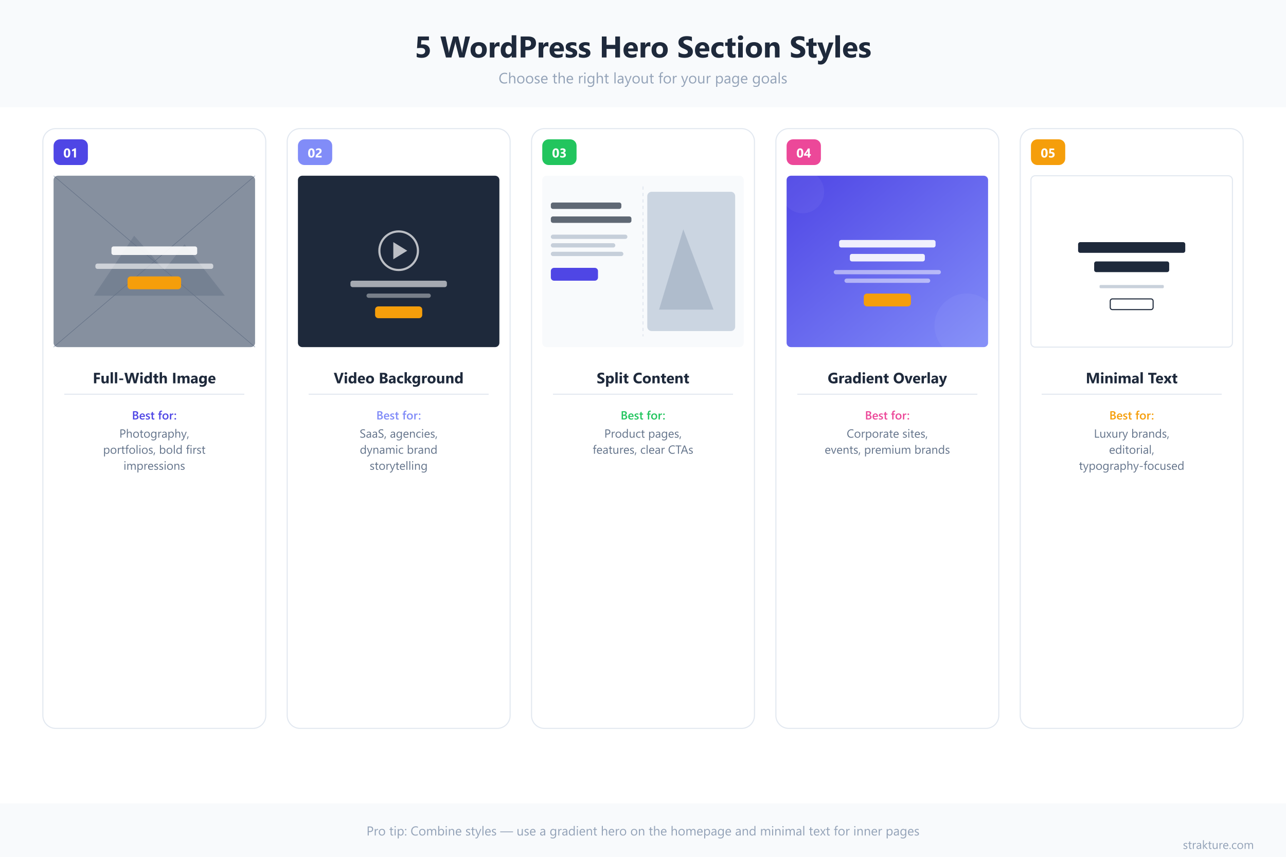
This guide walks through five distinct hero section styles, each built with core Gutenberg blocks. You will get the exact block structure, key settings, design tips, and a theme.json snippet for every approach.
Why Your WordPress Hero Section Matters
A study by the Nielsen Norman Group found that users spend 57% of their viewing time above the fold. Earlier research put that number at 80%. Either way, the pattern is clear: attention concentrates at the top of the page.
Hero sections occupy that prime real estate. A well-designed hero reduces bounce rates, increases time on site, and guides visitors toward a specific action. A poorly designed one creates confusion before your content ever gets a chance.
According to Google’s own research, simpler designs with low visual complexity are perceived as more appealing, sometimes within 17 milliseconds of exposure. The five styles below follow that principle: clean structure, strong typography, and purposeful visuals.
1. Full-Width Image Hero
This is the most common hero pattern on the web, and for good reason. A single striking image behind a headline and call-to-action button converts attention into clicks without overwhelming the visitor.
Block Structure
- Cover block (set to full width, background image applied)
- Heading block (H1 or H2, centered, white text)
- Paragraph block (subheadline, centered)
- Buttons block (one or two call-to-action buttons)
Key Settings
- Set the Cover block alignment to “Full Width” in the toolbar
- Adjust the overlay opacity between 30-50% to keep text readable
- Set a minimum height of 500-700px (or use the viewport height option for full-screen)
- Use the focal point picker to keep the subject visible on all screen sizes
Design Tips
Choose images with a clear subject and negative space for text placement. Avoid busy, cluttered photos where the headline gets lost. White or light text on a dark overlay works best for contrast. Keep your heading under 10 words for maximum impact on mobile screens.
theme.json Snippet
{
  "settings": {
    "color": {
      "palette": [
        { "slug": "hero-overlay", "color": "#1a1a2e", "name": "Hero Overlay" },
        { "slug": "hero-text", "color": "#ffffff", "name": "Hero Text" }
      ]
    },
    "typography": {
      "fontSizes": [
        { "slug": "hero-title", "size": "clamp(2.5rem, 5vw, 4.5rem)", "name": "Hero Title" }
      ]
    }
  }
}
Best for: Portfolio sites, agency homepages, photography businesses, and any brand with strong visual assets.
2. Video Background Hero
Static images tell a story. Video shows one unfolding in real time. A background video grabs attention instantly, which makes it ideal for product demos, hospitality brands, and SaaS landing pages.
Block Structure
- Cover block (full width, MP4 video uploaded as background)
- Heading block (H1 or H2, high-contrast text)
- Paragraph block (short supporting line)
- Buttons block (primary CTA)
Key Settings
- Upload your video directly to the Cover block (MP4 format, under 5MB)
- Set overlay opacity to 40-60% for readable text over moving footage
- Add a poster image as a fallback (mobile browsers often block autoplay)
- Use the focal point picker to anchor the visual center
Design Tips
Keep the video short (10-30 seconds) and make it loop without a visible cut. Avoid footage with fast cuts or text overlays that compete with your headline. Always test on mobile. Many phones disable autoplay to save data, so your fallback image needs to be just as strong as the video itself.
theme.json Snippet
{
  "settings": {
    "color": {
      "palette": [
        { "slug": "video-overlay", "color": "rgba(0, 0, 0, 0.55)", "name": "Video Overlay" },
        { "slug": "cta-accent", "color": "#ff6b35", "name": "CTA Accent" }
      ]
    }
  },
  "styles": {
    "blocks": {
      "core/cover": {
        "spacing": {
          "padding": { "top": "12vh", "bottom": "12vh" }
        }
      }
    }
  }
}
Best for: SaaS product pages, restaurants, real estate listings, and travel sites where motion adds emotional context.
3. Split Content Hero
Sometimes you need the headline and the image to share the stage equally. A split layout dedicates one column to text and the other to a visual, giving both room to breathe.
Block Structure
- Columns block (two columns, 50/50 or 55/45 split)
- Column 1: Group block containing Heading, Paragraph, and Buttons blocks
- Column 2: Image block (or Cover block for overlay effects)
Key Settings
- Set the Columns block to full width alignment
- Enable “Stack on mobile” so columns collapse vertically on small screens
- Add vertical padding to the text column’s Group block for centered alignment
- Set the image to “Cover” style so it fills the column height
Design Tips
The text column should have generous padding (48px or more on desktop) to prevent the headline from crowding the edge. Left-align the text for better readability in this layout. For the image column, use aspect ratios like 3:4 or 1:1 that hold up when the columns stack on mobile devices.
theme.json Snippet
{
  "settings": {
    "layout": {
      "contentSize": "1200px",
      "wideSize": "1400px"
    },
    "spacing": {
      "spacingSizes": [
        { "slug": "hero-padding", "size": "clamp(2rem, 5vw, 4rem)", "name": "Hero Padding" }
      ]
    }
  }
}
Best for: SaaS homepages, app landing pages, consulting firms, and any site where the text message is equally important as the visual.
4. Gradient Overlay Hero
Gradients add depth and personality without requiring a perfect photograph. A well-chosen gradient overlay turns even an average background image into something polished and on-brand.
Block Structure
- Cover block (full width, background image with gradient overlay)
- Heading block (H1 or H2, bold display text)
- Paragraph block (subtext in a lighter weight)
- Buttons block (CTA with contrasting background color)
Key Settings
- In the Cover block’s overlay settings, switch from “Solid” to “Gradient”
- Use your brand colors as gradient stops (linear direction works best)
- Set overlay opacity between 60-80% so the gradient dominates over the image
- Apply the duotone filter in block settings for an additional color treatment
Design Tips
Stick to two colors in your gradient. Three or more tend to look dated. For a modern feel, try a diagonal gradient (135 degrees) that moves from a dark brand color to a lighter accent. Test your gradient against both light and dark text to find the combination with the strongest WCAG contrast ratio.
theme.json Snippet
{
  "settings": {
    "color": {
      "gradients": [
        {
          "slug": "hero-brand-gradient",
          "gradient": "linear-gradient(135deg, #1a1a2e 0%, #16213e 50%, #0f3460 100%)",
          "name": "Hero Brand Gradient"
        }
      ],
      "duotone": [
        {
          "slug": "hero-duotone",
          "colors": ["#1a1a2e", "#e94560"],
          "name": "Hero Duotone"
        }
      ]
    }
  }
}
Best for: Creative agencies, event pages, startup landing pages, and brands with a strong color identity.
5. Minimal Text Hero
Not every hero needs a background image. The minimal text approach relies on typography, whitespace, and restraint. It feels confident because it lets the words do all the work.
Block Structure
- Group block (full width, with vertical padding for whitespace)
- Spacer block (80-120px to push content down from the header)
- Heading block (H1, large display size, centered or left-aligned)
- Paragraph block (one to two sentences, muted color)
- Spacer block (40-60px below the text for breathing room)
Key Settings
- Set the Group block background to a solid color (white, off-white, or dark)
- Use a custom font size for the heading (clamp formula recommended for responsiveness)
- Set heading letter-spacing to -0.02em for tighter, more refined display type
- Give the paragraph a lighter text color than the heading for visual hierarchy
Design Tips
Minimal heroes live and die by typography. Pick a display font with character. System fonts like Georgia or a custom Google Font like Inter or DM Sans work well. The heading size should be noticeably larger than anything else on the page. Use at least 120px of vertical padding above and below the text block to create the spacious feel this style demands.
theme.json Snippet
{
  "settings": {
    "typography": {
      "fontFamilies": [
        {
          "slug": "display",
          "fontFamily": "'DM Sans', sans-serif",
          "name": "Display"
        }
      ],
      "fontSizes": [
        { "slug": "display-xl", "size": "clamp(3rem, 6vw, 5.5rem)", "name": "Display XL" }
      ]
    }
  },
  "styles": {
    "blocks": {
      "core/heading": {
        "typography": {
          "letterSpacing": "-0.02em",
          "lineHeight": "1.1"
        }
      }
    }
  }
}
Best for: Personal blogs, editorial sites, developer portfolios, and modern brands that prioritize content over decoration.
Hero Section Style Comparison
Choosing between these five approaches depends on your content, your audience, and how much time you want to invest. Here is a side-by-side comparison.
| Style | Best For | Blocks Used | Difficulty | Mobile-Friendly |
|---|---|---|---|---|
| Full-Width Image | Portfolios, agencies | Cover, Heading, Paragraph, Buttons | Beginner | Yes (with focal point) |
| Video Background | SaaS, hospitality | Cover (video), Heading, Paragraph, Buttons | Intermediate | Needs fallback image |
| Split Content | App pages, consulting | Columns, Group, Heading, Paragraph, Buttons, Image | Intermediate | Yes (stacks on mobile) |
| Gradient Overlay | Startups, events | Cover (gradient), Heading, Paragraph, Buttons | Intermediate | Yes |
| Minimal Text | Blogs, developer sites | Group, Spacer, Heading, Paragraph | Beginner | Yes |
Common Hero Section Mistakes
Building a hero section is straightforward. Building one that actually performs well takes more awareness. Here are the mistakes that undercut most WordPress hero sections.
Ignoring Mobile Screens
Over 60% of global web traffic comes from mobile devices. A hero that looks stunning at 1440px wide can become unreadable at 375px. Always preview your hero in the block editor’s responsive mode. Check that text remains legible, buttons stay tappable, and images keep their focal point visible.
Overloading with Content
A hero section should communicate one idea and one action. When you stack a headline, three paragraphs, a form, social proof badges, and two rows of logos above the fold, nothing stands out. Aim for one headline, one supporting line, and one CTA. Everything else can go below.
Slow-Loading Media
Google reports that 53% of mobile users abandon sites taking longer than three seconds to load. A 15MB hero image or an uncompressed video file kills performance. Compress images to WebP format, keep videos under 5MB, and always set width and height attributes to prevent cumulative layout shift.
Poor Text Contrast
White text on a light image without an overlay fails WCAG accessibility standards. Always add a semi-transparent overlay to your Cover block (30% minimum for images, 40% for video). Test your color combinations with a contrast checker before publishing.
No Clear Call to Action
A beautiful hero without a button is a missed opportunity. Every hero section needs a clear next step. “Get Started,” “View Portfolio,” or “Watch Demo” all work. Vague labels like “Learn More” rarely drive meaningful clicks.
Build Better Hero Sections, Faster
The WordPress block editor gives you everything required to create professional hero sections without installing a page builder. The Cover block handles image and video backgrounds. The Columns block powers split layouts. The Group block with Spacers creates minimal text heroes. Combined with theme.json tokens for colors, gradients, and typography, you have full control over how each style looks and responds.
If building hero sections by hand feels repetitive, Strakture generates AI-powered hero patterns that match your active theme’s design system automatically. It reads your colors, fonts, and spacing tokens, then produces block patterns that look native to your site. Worth exploring if you build pages for clients or manage multiple WordPress sites.
Start with the style that fits your brand, adjust the settings for your content, and test on mobile before going live. A strong hero section does not need to be complicated. It needs to be clear, fast, and intentional.
WordPress Hero Section FAQs
Can I create a hero section in WordPress without a plugin?
Yes. The block editor includes everything you need. Use the Cover block for image or video backgrounds, the Columns block for split layouts, and the Group block with Spacers for minimal text heroes. No additional plugin is required for any of the five styles covered in this guide.
What is the best block for a WordPress hero image?
The Cover block is the best choice for hero images in WordPress. It supports background images, video, overlays, focal point adjustments, and full-width alignment out of the box. You can nest headings, paragraphs, and buttons directly inside it.
How do I add a video background to a WordPress hero section?
Add a Cover block, then upload an MP4 file (under 5MB) as the background media. Set the overlay opacity to 40-60% for text readability. Add a poster image as a fallback because many mobile browsers block autoplay video to conserve data.
What size should a WordPress hero section be?
Most hero sections use a minimum height of 500-700px on desktop. For full-screen heroes, set the Cover block’s minimum height to 100vh. On mobile, 50-70% of the viewport height works well to encourage scrolling while still making an impact.
Can Strakture generate hero section patterns for my theme?
Yes. Strakture analyzes your active theme’s colors, typography, and spacing tokens, then generates hero patterns that match your design system. It works with popular FSE themes like Kadence, Neve, Blocksy, and Astra, producing block patterns you can insert directly into the editor.
Leave a Reply